
Appearance
Design Settings
Design settings control the look of the whole store: colors, text size, page widths and the shape of buttons and fields. They belong to a design, so each design can have its own.
Every block on every page follows these settings. Change the button color once and every button, link highlight and selected option in the store follows, from the home page to the checkout.
Changing the settings
- Open the design in the editor.
- Choose Settings in the rail on the left. The Theme settings panel opens, with one group per topic.
- Open a group and change a setting. The preview updates immediately, also when you open another page in the preview.
- Choose Apply to keep the change in your draft, or Discard to drop it. Reset goes back to the saved values.
- Press Save to publish.
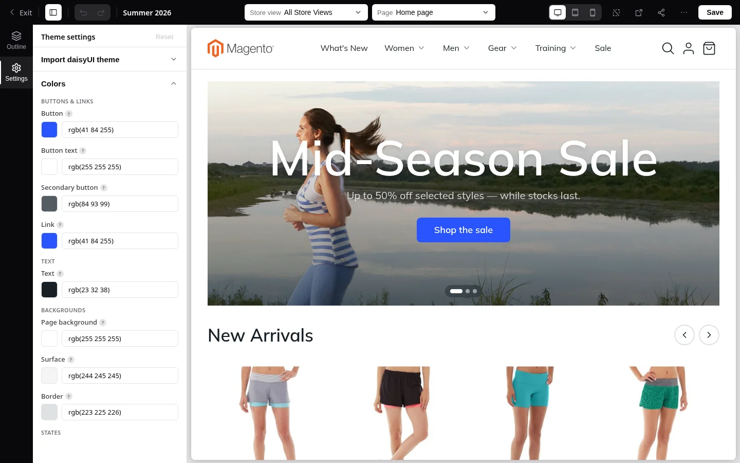
Colors
You only pick the base colors. Hover shades, focus rings and softer text are mixed from them automatically, so the palette always stays in tune.
Buttons and links
| Setting | Used for | Default |
|---|---|---|
| Button | Primary buttons and the accent of active controls | Blue |
| Button text | Text on primary buttons | White |
| Secondary button | Outline and text of outlined buttons such as Continue, Apply and Edit | Slate gray |
| Link | Links within text, such as Forgot password or View cart | Blue |
Text and backgrounds
| Setting | Used for | Default |
|---|---|---|
| Text | Headings and body text. Notes and captions use the same color, lighter. | Near black |
| Page background | Behind everything, including cards and fields | White |
| Surface | Panels that sit back from the page, such as order summaries | Light gray |
| Border | Lines, card borders and field outlines | Light gray |
States and accents
| Setting | Used for |
|---|---|
| Info, Success, Warning, Error | Backgrounds of notices. Error also marks invalid fields, and Success marks items in stock. |
| Info text, Success text, Warning text, Error text | Text and icons on those notices |
| Dark surface and Dark surface text | The dark band of an announcement bar, badges and sale markers |
| Secondary button text | Text on a filled secondary button |
Typography
| Setting | What it does | Default |
|---|---|---|
| Body font scale (%) | Scales all text in the store. 100% means body text is 16 pixels. | 100 |
| Heading font scale (%) | Scales only the large text, such as page titles and banner headings, on top of the body scale | 100 |
For example, to make headings stand out more without changing body text, raise the heading scale to 115%.
Layout
| Setting | What it does | Default |
|---|---|---|
| Site width (px) | The widest frame: header, footer and full-width sections | 1440 |
| Content width (px) | The frame of most pages, such as the cart and the account pages | 1152 |
| Narrow width (px) | The frame of short pages, such as the order confirmation | 768 |
| Header height (px) | The minimum height of the header on large screens. A taller logo makes it grow. | 80 |
Sections built with a Group block choose one of these three widths, so changing a width here updates every section that uses it.
Shape
| Setting | What it does |
|---|---|
| Corners — boxes | Roundness of cards, dialogs and notices |
| Corners — buttons | Buttons either match the fields or are fully rounded (pill) |
| Corners — fields | Roundness of text fields, dropdowns, checkboxes and badges |
| Border width | Outline thickness of buttons and fields |
| Control height | Height of buttons, text fields and dropdowns |
| Small control size | Size of checkboxes, radio buttons and toggles |
| Depth | Flat controls, or controls lifted with a light shadow |
Advanced
| Setting | What it does |
|---|---|
| Color scheme | Tells the browser whether the design is light or dark, so scrollbars, built-in controls and autofilled fields match it. Set it to Dark when you choose dark background colors. |
| Custom CSS | Extra styling added to every page, for anything the settings above do not cover. Intended for designers or developers. |
Importing a color theme
Lynx styles its buttons, fields, cards and notices with daisyUI, so themes made for daisyUI fit it directly. At the top of the Theme settings panel, Import daisyUI theme accepts a theme copied from the daisyUI theme generator. Lynx fills in the matching settings for you, and you can still fine-tune each one afterwards. As with any change, nothing is published until you press Save.
- Open the daisyUI theme generator. This link opens it with a ready-made theme to start from.
- Adjust the colors, corners and sizes until you like the result.
- Copy the theme's CSS from the generator.
- In the editor, open Settings › Theme settings › Import daisyUI theme, paste the CSS and import it.