
Appearance
The Editor
The Lynx editor is where you design the pages of your store. It shows a live preview of the store on the right and the structure of the page on the left. Every change shows in the preview straight away, and nothing reaches shoppers until you press Save.
To open it, go to Lynx › Designs and choose Build on the design you want to edit.
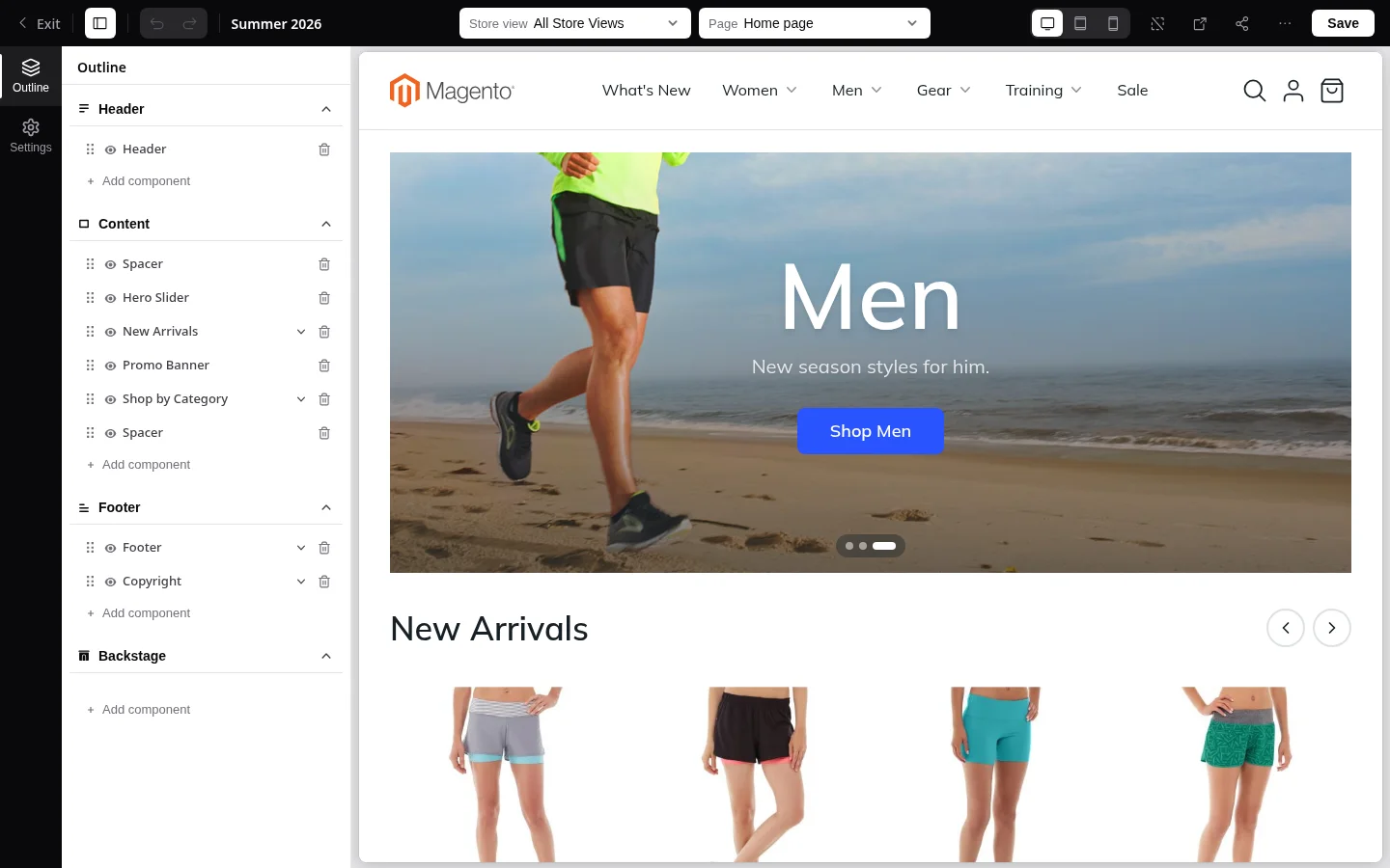
The top bar
From left to right, the bar along the top holds:
- Exit: back to the Magento admin, after asking you to confirm, since unsaved changes are lost.
- Hide panel: hides the left panel to give the preview the full width.
- Undo and Redo: step back and forward through your changes. The keyboard shortcuts are Ctrl+Z and Ctrl+Shift+Z.
- The name of the design you are editing.
- Store view: the store view used for the preview, so you see its language, currency and products.
- Page: the page you are editing, such as Home, Category, a product type, Cart or Checkout. Pages are grouped, and the list can be searched.
- Desktop, Tablet and Mobile: the width of the preview.
- Show all outlines: draws a frame around every block in the preview, so you can see how the page is built.
- Open preview in new tab: opens the saved version of the design in a separate browser tab.
- Share preview: creates a password-protected link for people without admin access. See Share a preview.
- More tools: export or import the page layout as a file, or copy the page from another design.
- Save: publishes your changes to the store.
The outline
The Outline on the left is the map of the page. It is divided into four zones, and every block of the page lives in one of them:
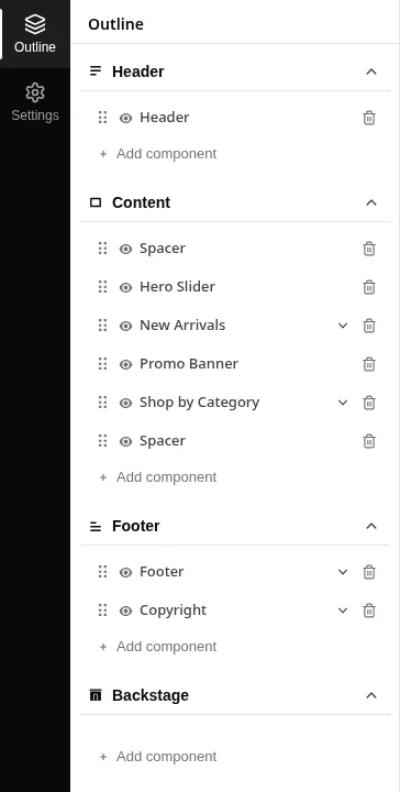
| Zone | What it holds |
|---|---|
| Header | The top of the page: announcement bar, logo, menu, search, account and cart. Shared by every page of the design. |
| Content | The main part of the page you are editing. This is the only zone that is different on each page. |
| Footer | The bottom of the page: links, newsletter, store and currency switchers, cookie notice. Shared by every page of the design. |
| Backstage | Blocks that show nothing on the page but add a behavior, such as Google Analytics. Shared by every page of the design. |
Because the Header, Footer and Backstage are shared, a change you make to them on one page shows on every page.
The checkout page
The checkout does not show the shared Header and Footer, so shoppers can focus on finishing their order. It has its own simple header with your logo and a link back to the cart. Backstage blocks such as analytics still run on the checkout.
Working with blocks
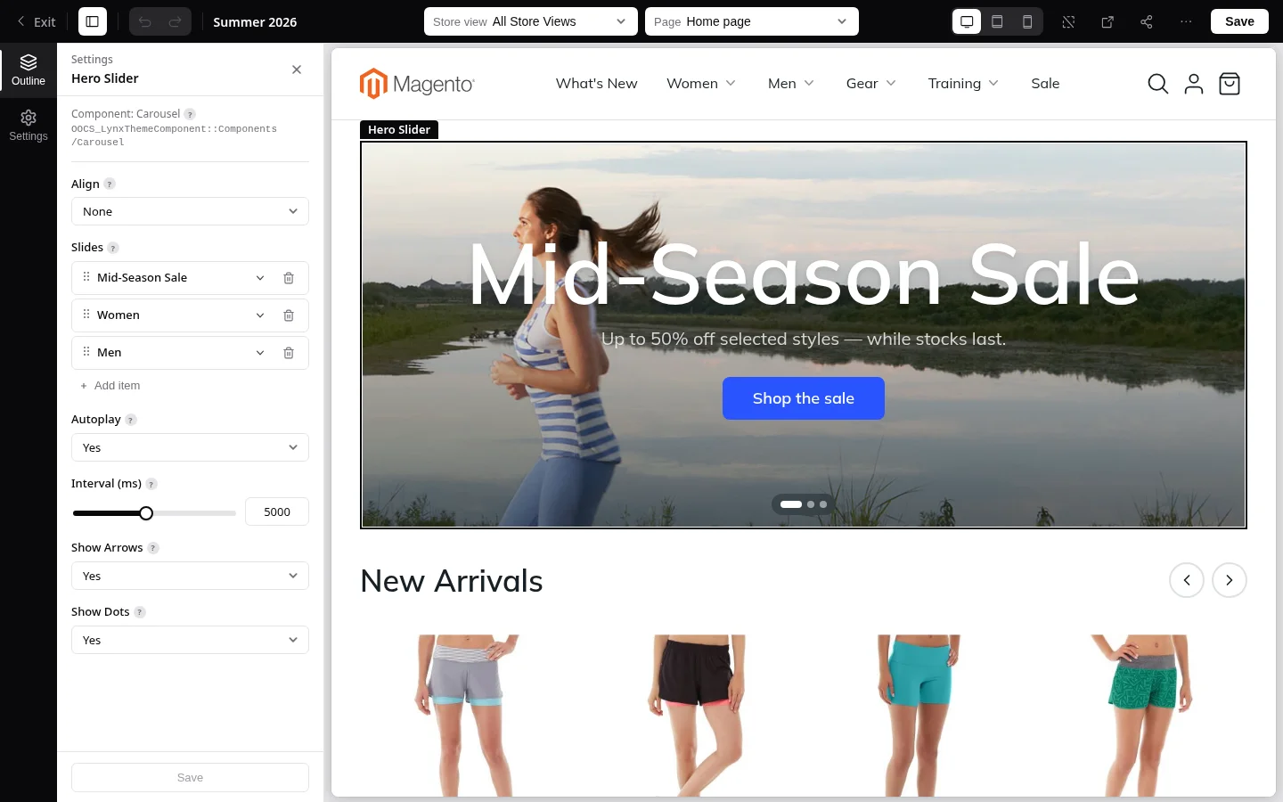
The rail on the far left switches between Outline, the blocks of the page, and Settings, the design settings. The Outline lists the blocks of the page as a tree. A block that holds other blocks, such as a Group or a Column, can be expanded to show what is inside it.
- Select a block by clicking it in the outline. The preview scrolls to it and draws a frame around it.
- Open its settings by double-clicking it. The settings panel lists everything you can change for that block. Hover the question mark next to a setting to read what it does. Save at the bottom of the panel applies your changes to the page; the Save button in the top bar then publishes them.
- Rename a block in the settings panel to make the outline easier to read. Leave the name empty to go back to the original name.
- Move a block by dragging it to a new place in the outline, including into or out of another block.
- Hide a block with the eye icon. A hidden block stays in the outline but does not show on the store.
- Remove a block with the remove icon. You are asked to confirm first.
Adding a block
Choose Add component at the bottom of a zone, or the add button inside a block such as a Group or Column, to open the component picker. Blocks are grouped into categories such as Layout, Text, Media, Form and Product List. Search by name across all categories, or browse them, then pick a block to insert it.
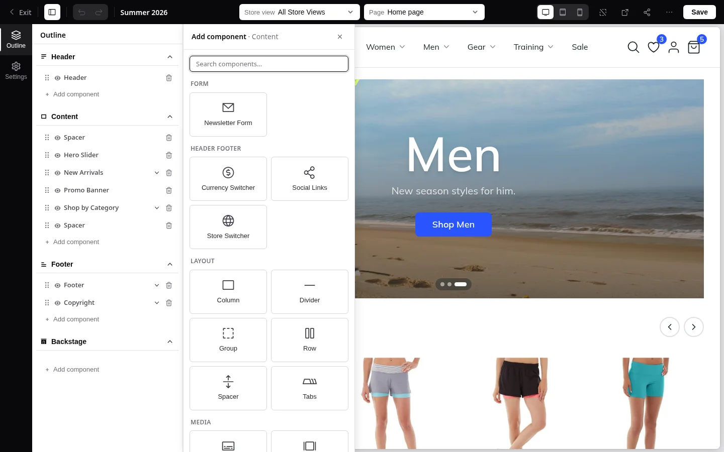
The picker only offers blocks that work in that place. For example, the checkout form is only offered on the checkout page, and header blocks are only offered in the header. Some blocks have slots that accept only one kind of block, and some allow each block only once; see Where a block can go.
Following links in the preview
Links in the preview work as they do on the store. When you open another page this way, the preview shows the saved version of that page and the outline becomes read-only. A bar at the top offers Edit this page, which switches the editor to that page, and a button takes you back to the page you were editing.
Share a preview
A shared preview lets someone see a design without an admin account, for example a client approving a new look.
- Choose Share preview in the top bar.
- Enter a password of at least 8 characters, or generate one.
- Choose how long the link should work: 3 hours, 1 day, 3 days or 7 days.
- Create the link, then copy the link and the password. The password is shown only once.
The person opening the link enters the password and then browses the store with that design. A shared preview always shows the saved design, not unsaved changes. Links that are still active are listed in the same dialog, and Revoke ends one immediately.
Designing CMS pages and categories
CMS pages and categories can have their own Lynx content instead of the standard text editor:
- Open the CMS page or category in the admin.
- In the Content section, choose Design with Lynx to open the editor on that page. For a CMS page, save the page once before the button appears.
- Build the content and save it in the editor.
- Back in the CMS page or category, turn on Render with Lynx and save.
Until Render with Lynx is on, shoppers keep seeing the standard content, so you can prepare the new version without anyone noticing. Turning it off later brings the standard content back, and your Lynx content is kept. For categories, the content can differ per store view.