
Appearance
Components
Components are the blocks you place on a page in the editor. Each one has its own settings, and every one of them follows your design settings, so a new block always matches the rest of the store.
Groups of components
| Group | Blocks | Page |
|---|---|---|
| Layout | Group, Row, Column, Tabs, Tab, Spacer, Divider | Layout |
| Content | Heading, Paragraph, Image, Button, Banner, Carousel, Link List, Social Links | Content |
| Products and search | Product Carousel, Bestsellers, Product Listing, Search Results, product page blocks | Products |
| Header, footer and site-wide | Header, Announcement Bar, Newsletter Form, Store and Currency Switcher, Cookie Consent, Back To Top, Google Analytics 4 | Site-wide |
| Cart and checkout | Checkout Cart, Checkout and its steps, express payment buttons, order success and failure | Cart & Checkout |
| Customer account | Sign in, registration, account sections, Orders and Returns, contact and 404 pages | Account & Pages |
A growing library
Lynx ships with ready-to-use components for layout, content, products, the cart, the checkout and the customer account, enough to build a complete store. New components are added with each release.
Build your own components
Developers and extension vendors can build their own components in Vue or React and add them to Lynx from a Magento module. A custom component works exactly like a built-in one:
- It appears in the editor's component picker, with its own settings.
- It can be limited to certain pages or zones.
- Its text settings can be translated per store view.
- It follows your design settings, so it matches the rest of the store.
Payment providers can plug their payment methods and express buttons into the Lynx checkout in the same way.
Developer documentation is available on request.
In the editor's component picker, blocks are grouped into smaller categories so they are quicker to find: Layout, Text, Media, Form, Header Footer, Utility, Product List, Search, Product Page, Checkout, Account and General.
Where a block can go
The component picker only offers blocks that make sense in the place you are adding to:
- Some blocks belong to one page. The checkout form is only offered on the checkout page, and the product listing only on category pages.
- Some blocks belong to one zone. The header and the announcement bar are only offered in the Header zone, the cookie notice and the back-to-top button in the Footer zone, and analytics in Backstage.
- Most content blocks go anywhere. Headings, paragraphs, images, buttons and layout blocks can be used in every zone and on every page.
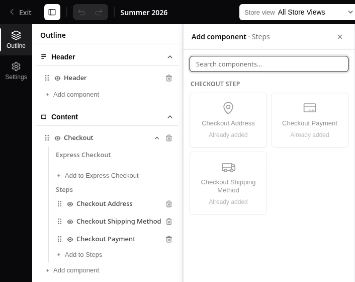
- Some slots accept only one kind of block. The Steps slot of the checkout takes only checkout steps, the Express Checkout slot only express payment buttons, the account frame only account sections, and Tabs only Tab blocks. The picker opened from such a slot lists only the blocks it accepts, and dragging another block into it is not possible.
- Some slots take each block only once. A checkout step, an express payment button or an account section can be added to its slot one time. A block that is already there stays in the picker but is greyed out and marked Already added.
Settings you will see often
Align
Blocks placed inside a Group with a constrained layout can reach wider than the text around them:
| Option | Result |
|---|---|
| None | Keeps the same width as the blocks around it |
| Wide | Reaches the site width |
| Full | Runs from one edge of the screen to the other |
Start, Center and End
Text alignment and positioning use Start and End instead of left and right. In a left-to-right language Start is left; in a right-to-left language such as Arabic it is right. Your layout stays correct in every store view without extra work.
Translations
Text settings, such as titles, labels and messages, have a Translations button next to them. The text you type in the field is the default. In the dialog, add a translation for each store view language using its locale code, for example de_DE or fr_FR, as set in Stores › Configuration › General › Locale Options. A store view without a translation shows the default text.
Load when shown
Product page blocks such as the description, specifications and reviews have this switch.
- Off: the content is sent with the page. Search engines read it, and it is visible straight away.
- On: the content is fetched only when it appears, for example when its tab is opened. The page loads a little faster.
Keep it off for content that matters for search, such as the product description.